You know how all relationships have this sweet phase where you’re consumed by each other and don’t spot any issues in one another? A friend of mine has been in that phase with AI for way too long. There’s nothing romantic about their relationship with AI, it’s just they delegate everything to it, AI has become their entire personality.
We have a side project together with a decent number of users. Every issue, every pull request description and every pull request comment’s response is written by AI with that stupid AI way of mimicking how aCtuAl pEoPle talk. It’s hard to get through to the human part but when you manage to do so, there’s only AI on their mind. They always say “let’s ask AI” like an LLM is an oracle that is always right. There’s no more joy in our collaboration, might as well let my agent deal with their agent and let the agents talk to each other without humans involved.
They would do things they have zero knowledge about and think they’re an expert. AI is great for helping you do things you don’t know much about but being able to do anything doesn’t automatically make you an expert in such thing (I call it LLM powered Dunning-Kruger).
It’s sad to see how some people willingly give up their seats to become human vessels for an AI personality.
I'm using an M1 MacBook Air for my stuff. It's an old but still good and capable machine that has been working flawlessly for years. There's one tiny thing: I made the mistake of buying the 256 GB version.
I'm constantly running out of space because of build files, iOS and Android caches and other temporary things. This issue happens so often that DaisyDisk lives in my Dock rent-free.
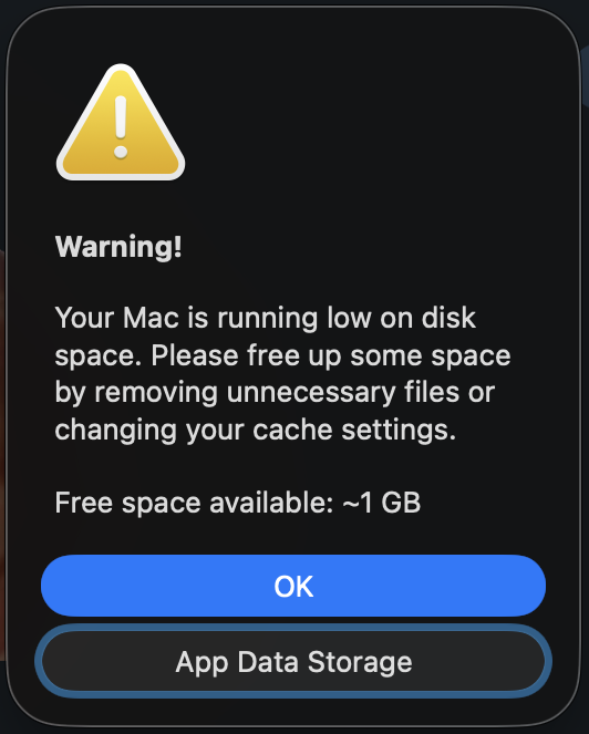
Telegram is happy to tell me that I'm running out of space every time I open it:
I think it starts noticing the space issue when there's less than 4 GB available… but it's none of its business! It's none of a
messenger app's business! I didn't ask it to check my disk space. I didn't ask it to interrupt what I was doing or about to do.
It's clearly not the most important app on my computer, why does it check how much space is left on my device and tell me about it all the time?
What if every other app that needs to cache media started showing pop-ups like that? It's a feature that nobody asked for and it only annoys the user when space issues happen on a constant basis.
Have you ever had that list item that shows relative time to the current moment, something like “5 minutes ago” or “two days ago”?
It’s usually easy to implement: simply use an existing package like timeago
that takes an event’s DateTime and current DateTime and returns a relative timestamp.
However, it’s also easy to make these relative timestamps outdated. Using DateTime.now()
to get the current time is fine at the moment when DateTime.now() is called but it's not fine when
DateTime.now() was last called 10 minutes ago and the timestamp still shows “just now”.
The provider
A colleague of mine introduced this small Riverpod provider to one of the projects years ago and I've been using it ever since:
/// Returns current time and updates it every minute.
final nowProvider =StateProvider<DateTime>((ref){final timer =Timer.periodic(constDuration(seconds:1),(_){final now =DateTime.now();if(ref.controller.state.minute != now.minute){
ref.controller.state = now;}});
ref.onDispose(timer.cancel);returnDateTime.now();});
Riverpod 3 code snippet
final nowProvider =NotifierProvider<NowNotifier, DateTime>(NowNotifier.new);classNowNotifierextendsNotifier<DateTime>{Timer? timer;@overrideDateTimebuild(){
timer?.cancel();
timer =Timer.periodic(constDuration(seconds:1),(_){final now =DateTime.now();if(state.minute != now.minute){
state = now;}});
ref.onDispose(()=> timer?.cancel());returnDateTime.now();}}
Watch provider using simple ref.watch:
@overrideWidgetbuild(BuildContext context,WidgetRef ref){// This is current time, updated automaticallyfinal now = ref.watch(nowProvider);
nowProvider immediately returns a value upon subscription and starts a timer that runs a
DateTime check every second.
Every time it runs, it checks if the minute value has changed from the last emitted value. It’s too much to update the UI every second, and this provider avoids that. Instead, it only emits a new value if a minute value changes (e.g. 16:05 changes to 16:06). It delivers an up-to-date timestamp every minute with a maximum delay of 1 second.
Tests
This provider can be overridden in widget tests allowing the time to be fixed and eliminating problems with timer disposal:
await tester.pumpWidget(UncontrolledProviderScope(
container:ProviderContainer(
overrides:[// Your other provider overrides here
nowProvider.overrideWith((ref)=>DateTime(2025,10,13)),],),
child:constMyFancyWidget(),),);
Riverpod 3 code snippet
...
nowProvider.overrideWith(()=>FakeNowNotifier(DateTime(2025,10,13))),...// Slightly more code for Riverpod 3 to create a FakeNowNotifierclassFakeNowNotifierextendsNowNotifier{finalDateTime dateTime;FakeNowNotifier(this.dateTime);@overrideDateTimebuild()=> dateTime;}
Not just relative timestamps
You can use this provider everywhere for centralized time access and get precise time control in widget tests for free.
Like any other provider, watching this provider makes UI reactive. If, for example, your app shows that a restaurant is open at the moment by comparing current time to restaurant's working hours, this provider will trigger a UI update for current status text and color:
final now = ref.watch(nowProvider);final isRestaurantOpen = myRestaurant.isOpen(now);final highlightColor = isRestaurantOpen ?Colors.green :Colors.red;final statusText = isRestaurantOpen ?'Open':'Closed';