Flutter app with a touch of Material You colors, please
Android 12 brings the third iteration of Material Design called Material You - along with other changes apps and home screen widgets may now change their look according to wallpaper colors or selected system palette.
There are no design guidelines for using these new colors although Google is updating their apps - Gmail, Keep, Phone, Calendar and others have already got their Material You makeover. It feels a bit like a secret - there are no guidelines but apps are getting updated. Unfortunately, Flutter has no support for the new coloring system yet.
As a developer I want to support and utilize the latest available specifications and APIs. Let's get the new colors in Flutter.
Getting colors using a platform channel
The idea is simple - call a "native" platform code to get a list of colors. The colors we're interested in are listed in Dmitry Chertenko's article and in the official documentation. There are several new system color attributes available:
system_accent1_0
system_accent1_10
system_accent1_50
...
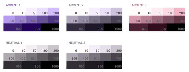
There are three groups of accent colors and two groups of neutral colors:

Each color group has 13 shades and looks like a gradient - it starts with a lighter color and ends with a darker one. Switching between light and dark system modes does not change the palette's colors.
Note: make sure to set
targetSdkto 31 in app'sbuild.gradlefile. Otherwise the newR.color.*attributes are not accessible.
Making a call via platform channel is trivial so here's the code.
The map of colors in Flutter's
MaterialColor
is slightly different from what Android offers - Flutter expects to have a primary color and its 10 shades, Android provides 13 shades. I simply ignored some of the shades on the Flutter side although it doesn't feel right - some of the ignored colors could be useful (see palette usage below).
Guessing Material You colors usage
As there are no guidelines on how to use the colors. I've used a modern nanotech tool (a simple color picker) to find matches between my current Material You palette and real apps. This may help in understanding how colors should be used.
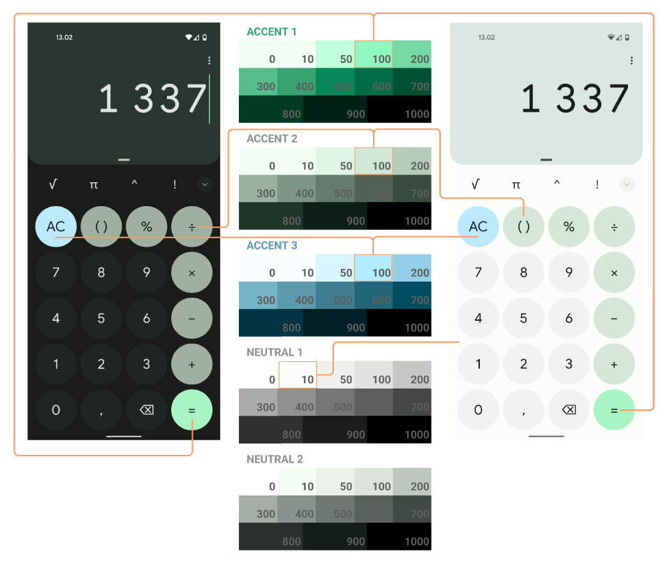
Calculator
Calculator uses colors from all three accent color groups. I couldn't find a color matching digit button's background - perhaps it's a color with opacity and it blends in with window background which makes it's hard to get the actual color.

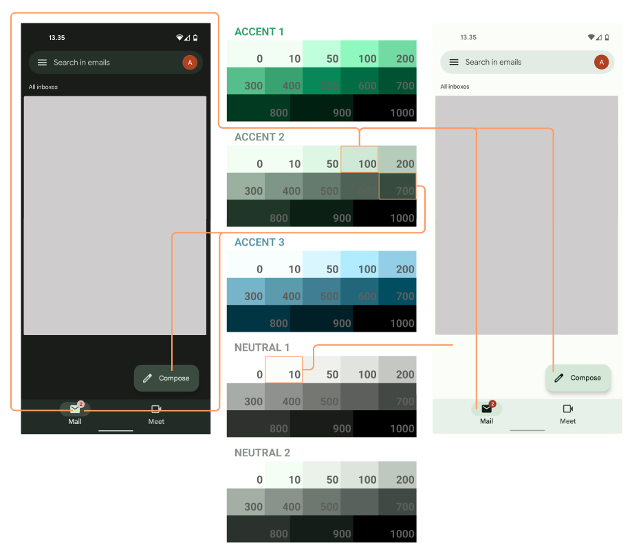
Gmail
Search and navigation bars use changed version of palette's colors. My guess is they use a transparent color and a solid color background container (white for light theme and black for dark theme) to make the final color opaque. Let's see what Material You guidelines say about it once they're published.

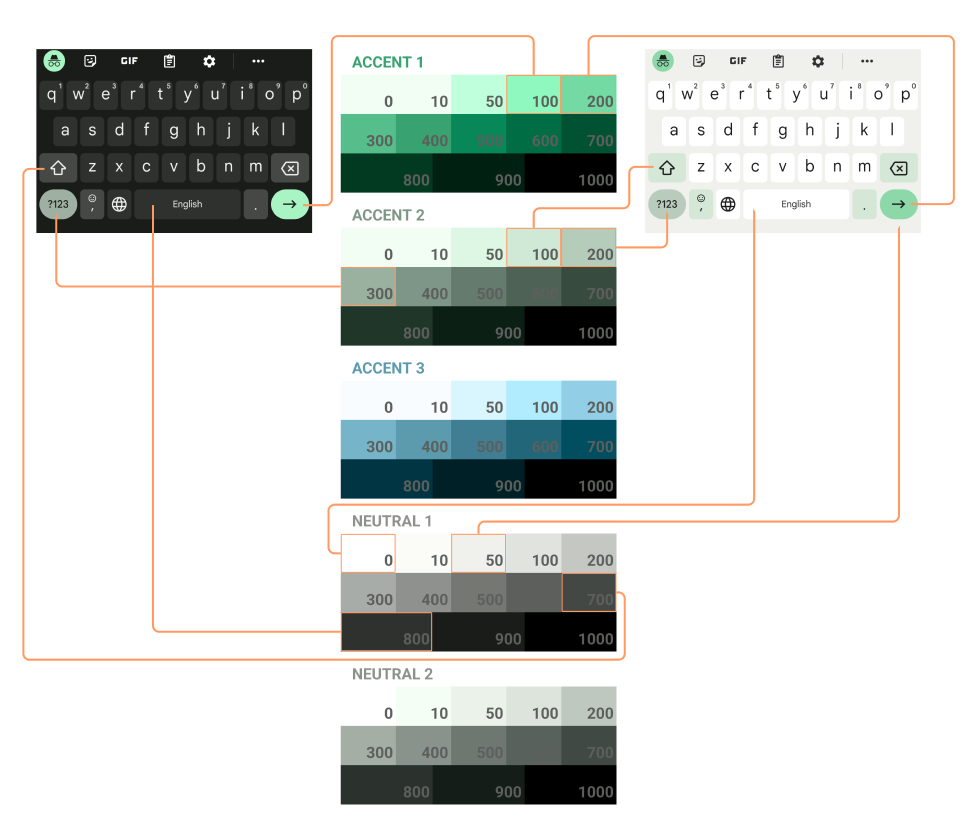
Gboard
Pretty much every color is from the palette:

There's no clear logic which color to use in each case. Looks like the way to achieve colorful Material You looking apps is to use shades 100-300 of accent colors for main controls and lighter\darker colors for the rest of the items.
Using Material You colors in Flutter
Using colors in Flutter is simple: get a color and set it as a primary swatch:
FutureBuilder(
  future: getMaterialYouColor(),
  builder: (context, AsyncSnapshot<MaterialYouPalette?> snapshot) {
    final primarySwatch = snapshot.data?.accent1 ?? Colors.blue;
	return MaterialApp(
	  theme: ThemeData(
	    primarySwatch: primarySwatch,
...
The biggest challenge comes with widgets customization. Setting a primary swatch is simple but overriding themes for all needed widgets could be hard - it's a lot to do, to test and to maintain. And then there's dark theme. And fallback theme for other platforms where Material You colors are not supported. Let's hope Flutter will have a better and simpler solution for that.
In this article I'm looking for a way to bring Material You colors to Flutter. Can it be done? Yes. Is using these colors to style widgets a pleasant experience? Doesn't feel so.